Secrets to Choosing the Perfect Color Palette for your Baby’s Nursery
Tips by Architect Thais Silva – Luisa’s Mom.
Blue? Pink? Yellow? Green? Green! But which shade of green…?
It’s hard, isn’t it? If you are in doubt about choosing the right color palette, stick with us! In this article, we’ll guide you through picking the perfect color for your baby’s nursery.

What are your preferences?
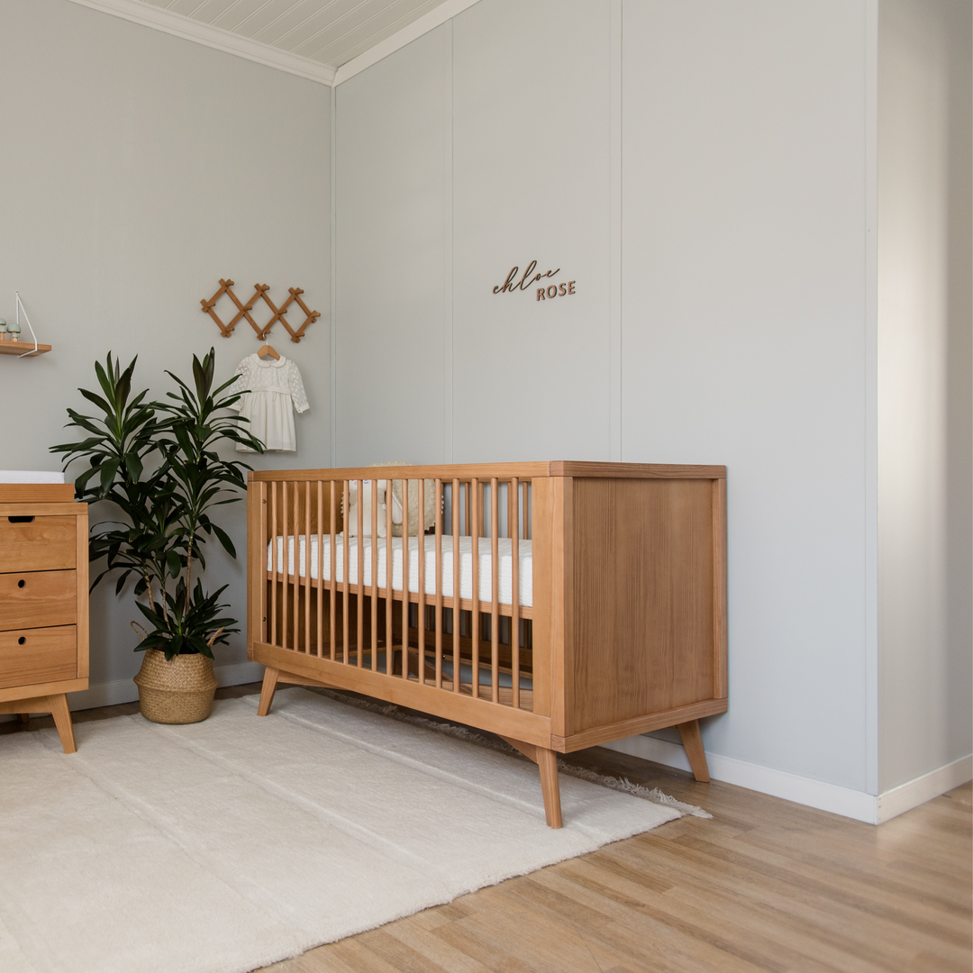
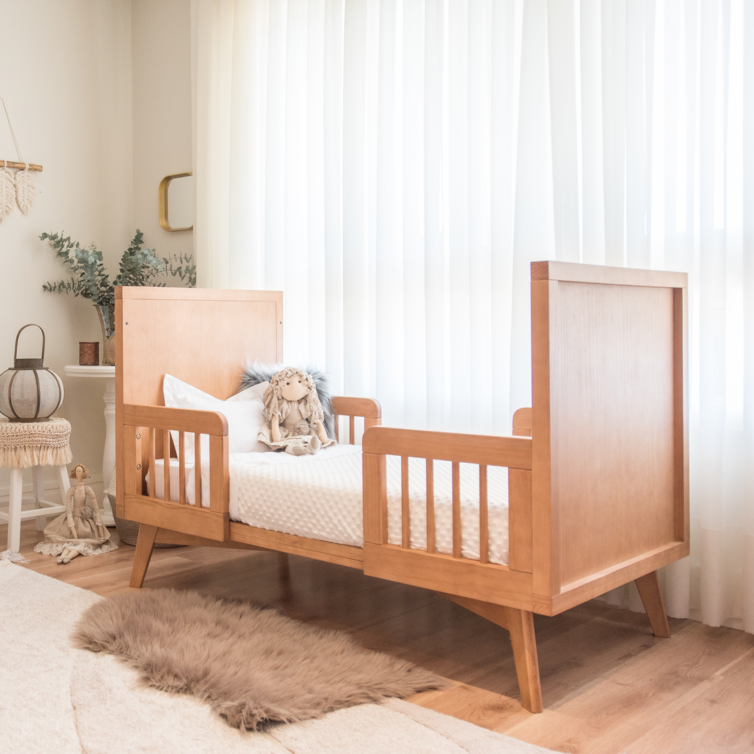
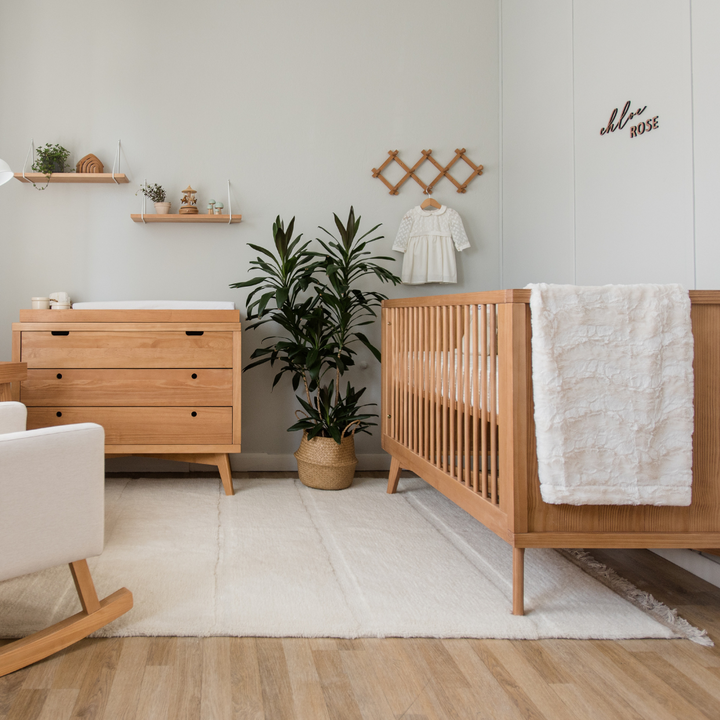
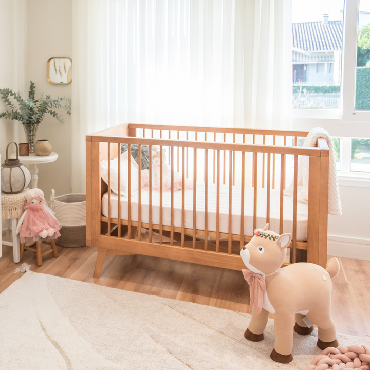
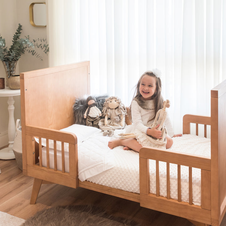
Regarding baby nurseries, I believe it’s important to remember that this is also a room for the parents. Therefore, take some time to consider which colors you like and which colors you don’t like. In addition to the color, deciding which styles of ambiance really uplift you, will make your choice much easier because it will lead you to a color palette. Do you prefer traditional minimalistic ambiances, in neutral shades? Or either a contemporary ambient full of colors and vibrant prints? There are country décor styles that consist more of nude and brown tones, and you can also choose a more classic décor in which the color white (or off-white) paired with decorative details match beautifully – just like in this nursery bellow.
"The nursery is also a room for the parents"

Less is more!
Have you noticed that the less options we have to choose from, the easier it is to make a decision? So, the second tip is this: choose between 5-10 projects or images of nursery rooms on Pinterest or Instagram. Try not to create a folder with thousands of references! If you have chosen more than this, try to reduce this number to the max. After that, identify which piece of the décor repeats itself the most: Is it the color? The type of crib? The theme? This is an excellent way of having more direction into what is more pleasant for us and we don’t even realize or fail to identify.
“The less options we have to choose from, the easier it is to make a decision”
When the color is chosen, another challenge arises: which shade?
Within the spectrum of a color, there are different temperatures ranging from cool to warm. To choose between one of them, always check the darker shade of your palette - the closer to blue, the cooler; the closer to yellow (or brown), the warmer. I’ve left below an image to show you neutral shades that are very easy to identify if the colors are warm or cool:

Avoid the obvious!

Contrast!
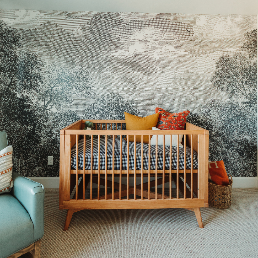
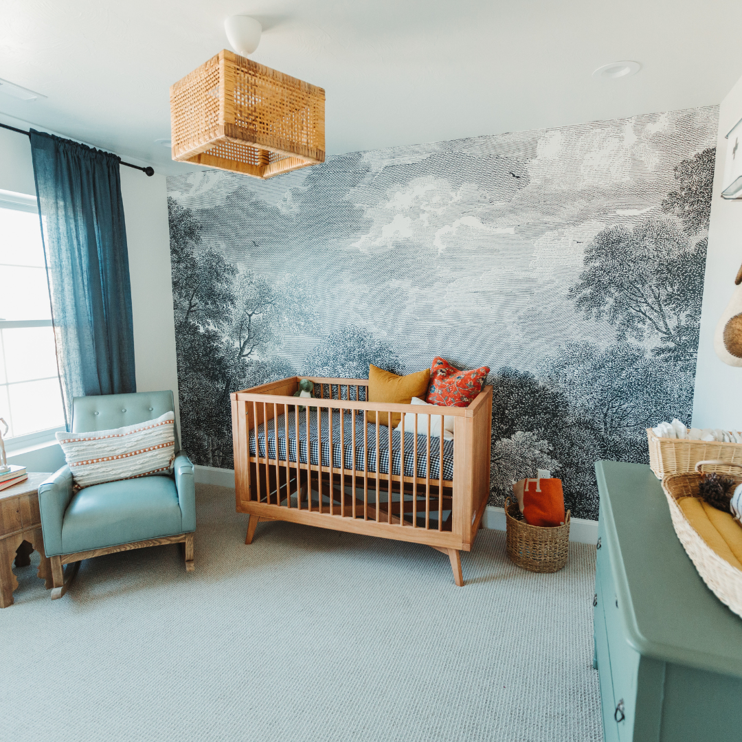
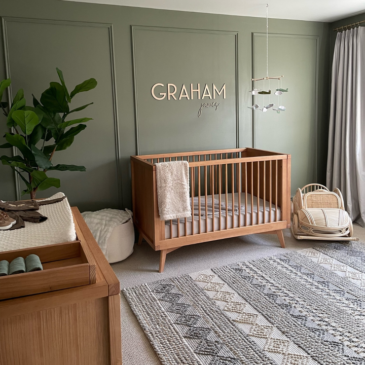
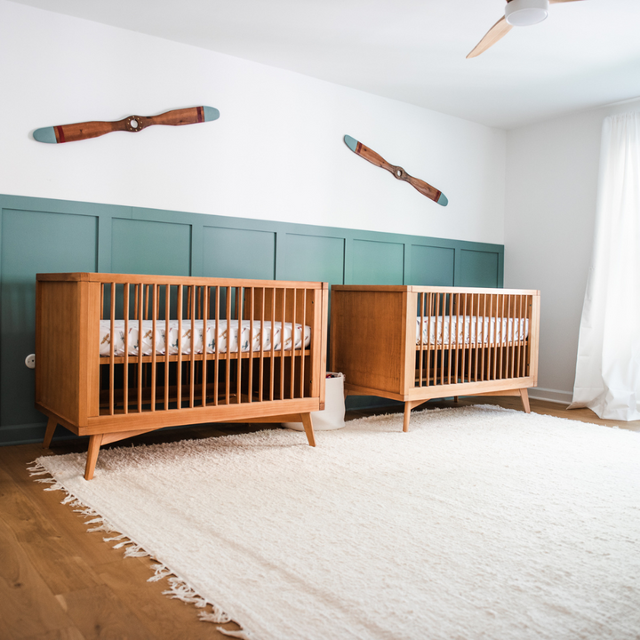
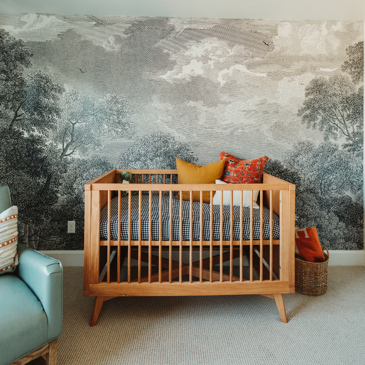
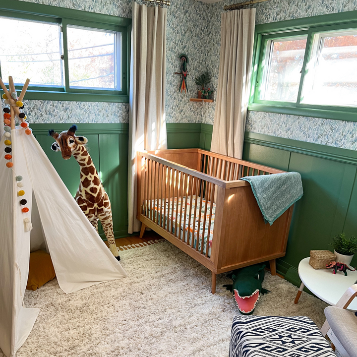
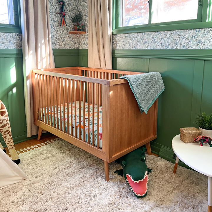
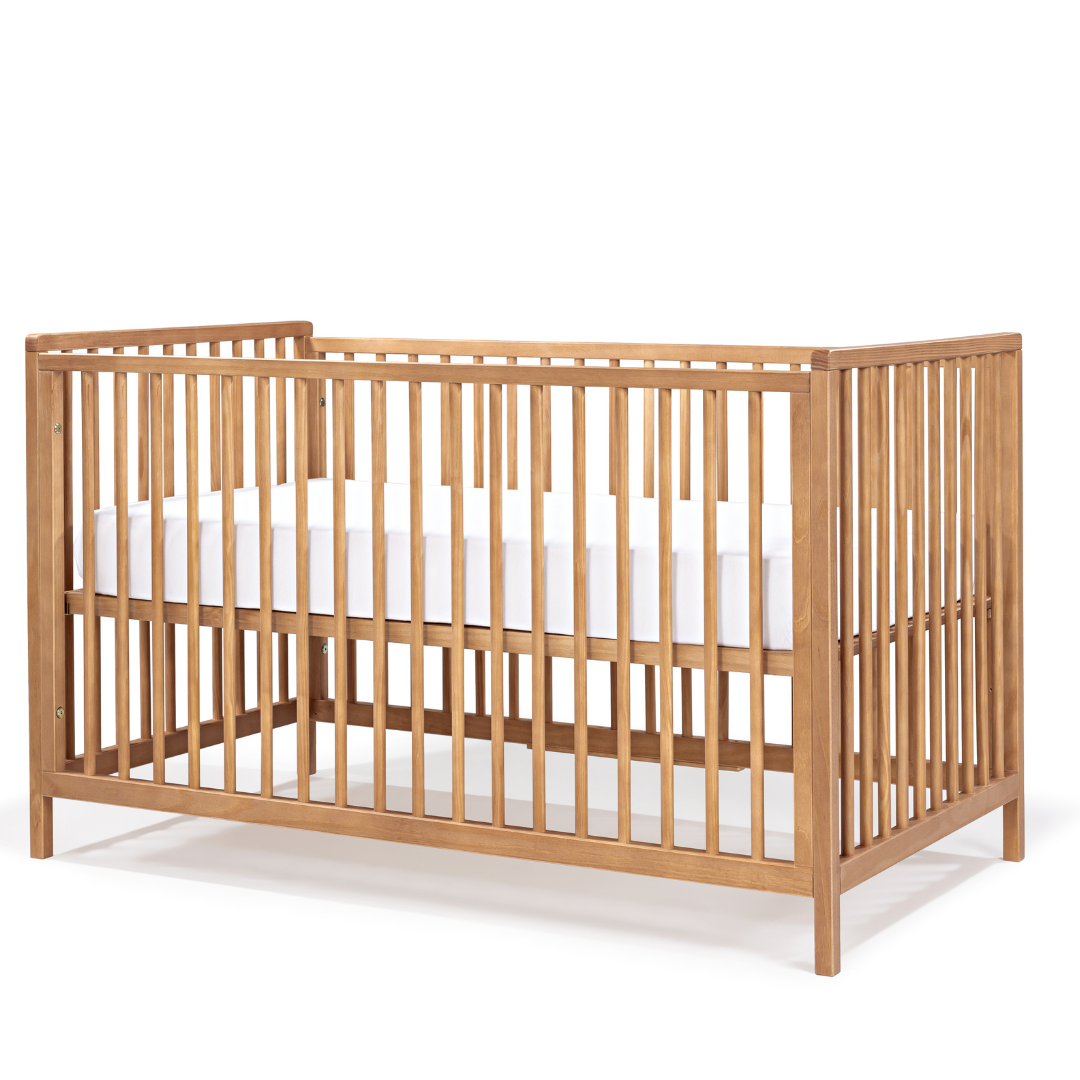
If you choose a palette of neutral colors for your walls, don’t forget to add contrast using different colors for furniture and the décor (and the opposite also works!), like in the image below, where Simply Nursery’s Retro crib in Natural Washed stands out against a dark wall.
If the chosen color is a dark gray for example, what about a wooden crib in a lighter tone? Yet, don’t be afraid to give touches of color in your layette - it’s easy to change these items in the nursery’s décor, so be bold! Cushions full of personality, textured rugs, colorful blankets and various toys can completely change a room!

Are you still in doubt? Choose a neutral color: it never goes wrong!
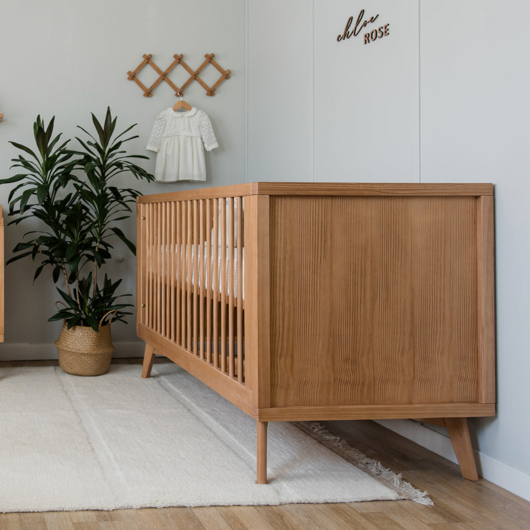
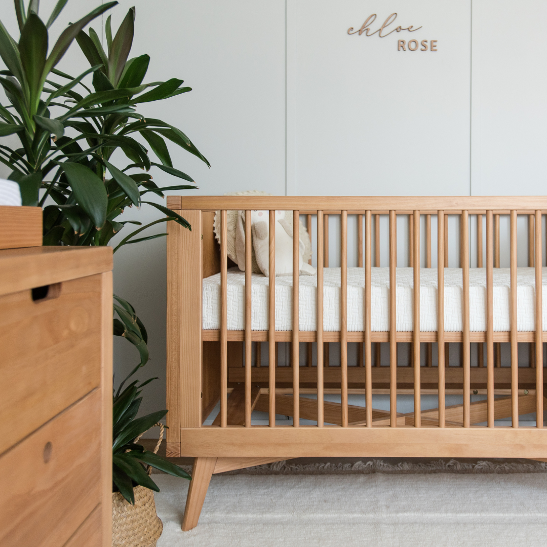
Personally, I prefer warmer tones - I believe they make rooms cozier, and when paired with solid wood furniture and a more textured layette (baskets, natural fabrics, knitted or crochet pieces) they make the perfect combination.

If you feel overwhelmed with the number of neutral shades and their undertones, I selected a few from main paint brands to help you choose:

Remember: Lighting directly influences colors!
I always recommend, in home decor, the use of lightbulbs with the temperature color between 2800K or 3000K (warm light) - never white light (6000K)! I think it’s nice to create at least 2 lighting scenarios: a main light to use in a day-to-day basis, in diaper changing, for example, and activities that require more attention to details; and an indirect lighting that can be done with lampshades for the after shower, breastfeeding time and other moments of relaxation. Soon we’ll have an article to show you more about lighting in more details.
With this guide, I hope you can choose a color palette that expresses everything you want to fell in your baby’s nursery room.
A warm hug full of love from Luli’s mamma 😊

Thais Silva has been a practicing architect for over 6 years. In 2023, she became a mother and can now add more knowledge, empathy and tenderness in each of her projects of nurseries and kids’ rooms.






















Leave a comment